Create a Responsive Navigation Bar using HTML, CSS, and JavaScript
Posted by Kosal
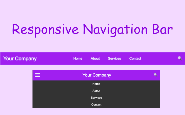
Creating a beautiful menu bar using HTML, CSS, and JavaScript involves creating the structure with HTML, styling it with CSS, and adding interactivity with JavaScript. Here's a simple example of a responsive and stylish menu bar:
HTML:
<!DOCTYPE html>
<html lang="en">
<head>
<meta charset="UTF-8" />
<meta name="viewport" content="width=device-width, initial-scale=1.0" />
<link rel="stylesheet" href="styles.css" />
<title>Responsive Menu Bar</title>
</head>
<body>
<div class="navbar">
<div class="toggle-btn" onclick="toggleMenu()">
<span></span>
<span></span>
<span></span>
</div>
<div class="logo">Your Company</div>
<div class="menu">
<a href="#">Home</a>
<a href="#">About</a>
<a href="#">Services</a>
<a href="#">Contact</a>
</div>
<div id="searchBar">
<input type="text" id="searchInput" placeholder="Search..." />
</div>
<div class="search-btn" onclick="toggleSearch()">
<span>🔍</span>
</div>
</div>
<div class="content">
<!-- Your page content goes here -->
<h1>Welcome to Your Company</h1>
<p>This is a professional menu bar example.</p>
</div>
<script src="script.js"></script>
</body>
</html>
CSS (styles.css):
body {
  margin: 0;
  font-family: "Arial", sans-serif;
  background-color: #f4f4f4;
}

.navbar {
  background-color: #a020f0;
  padding: 0 15px;
  display: flex;
  justify-content: space-between;
  align-items: center;
  box-shadow: 0px 2px 5px rgba(0, 0, 0, 0.1);
  height: 60px;
}

.logo {
  color: white;
  font-size: 24px;
}

.menu {
  display: flex;
  justify-content: center;
  align-items: center;
}

.menu a {
  color: #fff;
  text-decoration: none;
  margin: 0 20px;
  font-size: 16px;
  transition: color 0.3s;
}

.menu a:hover {
  color: #ffcc00;
}

.search-btn span {
  color: #ddd;
  border: none;
  cursor: pointer;
  font-size: 20px;
}

#searchBar {
  display: none;
}
.show {
  display: block !important;
}
.hide {
  display: none !important;
}

#searchInput {
  opacity: 0;
  width: 0;
  padding: 0;
  transition: opacity 0.3s, width 0.3s;
}

.show #searchInput {
  opacity: 1;
  width: 150px;
  padding: 8px;
}

.toggle-btn {
  display: none;
  flex-direction: column;
  cursor: pointer;
}

.toggle-btn span {
  height: 3px;
  width: 25px;
  background-color: white;
  margin: 6px 0;
  display: block;
}

.show-menu {
  display: flex !important;
}

@media screen and (max-width: 768px) {
  .menu {
    display: none;
    flex-direction: column;
    width: 100%;
    text-align: center;
    position: absolute;
    top: 60px;
    left: 0;
    background-color: #333;
    box-shadow: 0px 2px 5px rgba(0, 0, 0, 0.1);
  }

  .menu a {
    margin: 10px 0;
  }

  .toggle-btn {
    display: flex;
  }
}
JavaScript (script.js):
function toggleSearch() {
  const searchInput = document.getElementById("searchBar");
  searchInput.classList.toggle("show");
  const menu = document.querySelector(".menu");
  menu.classList.toggle("hide");
}

function toggleMenu() {
  const menu = document.querySelector(".menu");
  menu.classList.toggle("show-menu");
}
This example includes a responsive menu bar with a toggle button for smaller screens. The menu bar has a simple color scheme, and you can further customize the styles to fit your design preferences. The JavaScript function toggleMenu is used to show/hide the menu on smaller screens.