Beautiful Toggle Switch Using HTML & CSS
Posted by Kosal
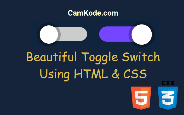
This HTML and CSS code defines a stylish and interactive toggle switch with an associated checkbox. The toggle switch is presented as a sleek rectangular container with rounded corners and a background color. A circular knob, represented by a pseudo-element, slides smoothly within the switch to visually indicate the on/off state.
HTML Code:
<label>
  <input class="checkbox" type="checkbox" checked />
  <div class="toggle-switch"></div>
</label>
CSS Code:
.toggle-switch {
  background-color: #ccc;
  height: 15px;
  width: 50px;
  border-radius: 15px;
  position: relative;
  cursor: pointer;
  transition: background-color 0.25s;
}

.toggle-switch:before {
  content: '';
  background-color: #fff;
  height: 20px;
  width: 20px;
  position: absolute;
  top: -2px;
  left: -2px;
  border-radius: 50px;
  box-shadow: 0 0 0 3px rgba(0, 0, 0, 0.25);
  transition: left 0.25s;
}

.checkbox {
  visibility: hidden;
}

.checkbox:checked + .toggle-switch {
  background-color: #7446ff;
}

.checkbox:checked + .toggle-switch:before {
  left: 32px;
}
In summary, this HTML and CSS code presents an aesthetically pleasing and user-friendly toggle switch, seamlessly integrating form and function. The combination of a hidden checkbox and carefully crafted styles produces a toggle switch with smooth transitions, rounded edges, and a visually appealing sliding knob. The design is not only visually engaging but also intuitive, providing users with a clear and interactive way to control an on/off state.