Creating a Responsive Sidebar with Icons and Expandable Menus
Posted by Kosal
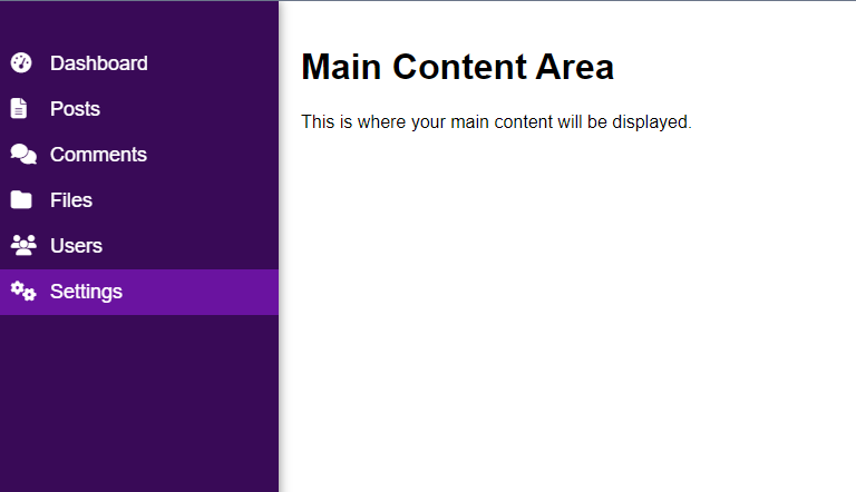
If you're looking to build a responsive sidebar with icons and expandable menus, this HTML and CSS template can serve as a great starting point. Let's break down the key components and features of this template.
1. Sidebar Structure
The sidebar is designed to provide quick navigation with a clean and organized layout. It includes various menu items, each represented by an icon from Font Awesome. Submenus are also implemented to organize related links.
<body>
  <a class="toggle-btn" onclick="toggleSidebar()">
    <i class="fas fa-bars"></i>
  </a>

  <div class="sidebar">
    <a class="btn-close" onclick="toggleSidebar()">
      <i class="fas fa-close"></i>
    </a>
    <ul>
      <li class="parent">
        <a href="#"><i class="fas fa-tachometer-alt icon"></i> Dashboard</a>
      </li>

      <li class="parent">
        <a href="#"><i class="fas fa-file-alt icon"></i> Posts</a>
      </li>

      <li class="parent">
        <a href="#"><i class="fas fa-comments icon"></i> Comments</a>
        <ul class="sub-menu">
          <li><a href="#">Pending</a></li>
          <li><a href="#">Approved</a></li>
        </ul>
      </li>

      <!-- Add more links and submenus as needed -->
    </ul>
  </div>

  <div class="main-content">
    <!-- Your main content goes here -->
    <h1>Main Content Area</h1>
    <p>This is where your main content will be displayed.</p>
  </div>
</body>
2. Styling (styles.css)
The styling is minimalistic, focusing on a dark background for the sidebar and a smooth transition effect on hover. The main content area is given a margin to accommodate the expanded sidebar.
body {
  margin: 0;
  font-family: "Arial", sans-serif;
}

.sidebar {
  height: 100%;
  width: 250px;
  position: fixed;
  top: 0;
  left: 0;
  background-color: #390a57;
  padding-top: 20px;
  box-shadow: 0 0 10px rgba(0, 0, 0, 0.5);
  transition: width 0.3s;
}

.sidebar ul {
  list-style: none;
  padding: 0;
}

.sidebar a {
  display: block;
  padding: 10px;
  text-decoration: none;
  font-size: 18px;
  color: white;
  transition: 0.3s;
}

.sidebar li a:hover {
  background-color: #6a13a0;
}

.sidebar .icon {
    width: 20px;
    height: 20px;
  margin-right: 10px;
}

.sidebar .sub-menu {
  display: none;
  padding-left: 40px;
}

.sidebar .sub-menu a {
  font-size: 16px;
}

.main-content {
  margin-left: 250px;
  padding: 20px;
}

/* Media Query for Mobile */
@media (max-width: 768px) {
  .sidebar {
    width: 0;
    overflow: hidden;
  }

  .main-content {
    margin-left: 0;
  }

  .toggle-btn {
    display: block !important;
  }

  .sidebar .btn-close {
    display: block !important;
  }
}

.toggle-btn {
  display: none;
  position: fixed;
  top: 10px;
  left: 10px;
  font-size: 20px;
  color: #333;
  cursor: pointer;
}

.sidebar .btn-close {
  display: none;
  position: absolute;
  color: #fff;
  right: 20px;
}
3. JavaScript Interaction (script.js)
JavaScript is used to toggle the display of submenus when a parent link is clicked. This enhances the user experience, allowing them to expand or collapse relevant sections.
function toggleSidebar() {
  var sidebar = document.querySelector(".sidebar");
  sidebar.style.width = sidebar.style.width === "250px" ? "0" : "250px";
}

document.addEventListener("DOMContentLoaded", function () {
  var parentLinks = document.querySelectorAll(".parent");

  parentLinks.forEach(function (link) {
    link.addEventListener("click", function () {
      var subMenu = link.querySelector(".sub-menu");
      if (subMenu) {
        subMenu.style.display =
          subMenu.style.display === "block" ? "none" : "block";
      }
    });
  });
});
Conclusion
This template provides a flexible foundation for creating a responsive sidebar with icons and expandable menus. You can further customize it based on your specific requirements and integrate it into your web project.