Mastering Data Visualization in Python with Matplotlib
Posted by Kosal
Python, with its powerful libraries like Matplotlib, offers extensive capabilities for data visualization. Matplotlib is a versatile library that enables users to create various types of plots and charts, making it an essential tool for data analysis and presentation. Below is a comprehensive guide on how to use Python for data visualization with Matplotlib:
1. Install Matplotlib
Before you start, ensure you have Matplotlib installed. You can install it via pip:
pip install matplotlib
2. Import Matplotlib
Import Matplotlib into your Python script or notebook:
import matplotlib.pyplot as plt
3. Basic Plotting
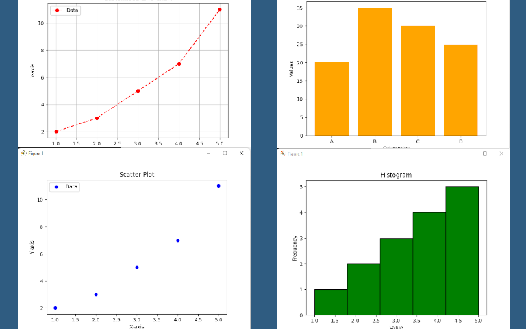
Start by creating a simple plot. Matplotlib provides functions to plot lines, scatter plots, histograms, bar plots, and more. Here's an example of plotting a line chart:
# Sample data
x = [1, 2, 3, 4, 5]
y = [2, 3, 5, 7, 11]

# Plotting
plt.plot(x, y)
plt.xlabel('X-axis')
plt.ylabel('Y-axis')
plt.title('Line Chart')
plt.show()
4. Customizing Plots
You can customize your plots by adding titles, labels, legends, grid lines, changing colors, line styles, marker styles, etc. Here's an example:
plt.plot(x, y, color='red', linestyle='--', marker='o', label='Data')
plt.xlabel('X-axis')
plt.ylabel('Y-axis')
plt.title('Customized Line Chart')
plt.legend()
plt.grid(True)
plt.show()
5. Creating Different Types of Plots
Matplotlib supports various plot types. Here are some examples:
- Scatter plot:
plt.scatter(x, y, color='blue', label='Data')
plt.xlabel('X-axis')
plt.ylabel('Y-axis')
plt.title('Scatter Plot')
plt.legend()
plt.show()
- Histogram:
data = [1, 2, 2, 3, 3, 3, 4, 4, 4, 4, 5, 5, 5, 5, 5]
plt.hist(data, bins=5, color='green', edgecolor='black')
plt.xlabel('Value')
plt.ylabel('Frequency')
plt.title('Histogram')
plt.show()
- Bar plot:
categories = ['A', 'B', 'C', 'D']
values = [20, 35, 30, 25]
plt.bar(categories, values, color='orange')
plt.xlabel('Categories')
plt.ylabel('Values')
plt.title('Bar Plot')
plt.show()
6. Saving Plots
You can save your plots as image files using Matplotlib. Just add plt.savefig('plot.png') before plt.show().
Conclusion
Matplotlib is a powerful library for data visualization in Python, offering a wide range of plot types and customization options. By following the steps outlined in this guide, you can create stunning visualizations to explore and communicate your data effectively. Whether you're analyzing data for insights or presenting findings to others, Matplotlib is an indispensable tool in your data science toolkit.